

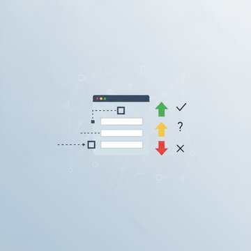

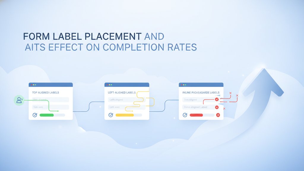
Where you put a form label directly changes how many people finish your form. The most reliable choice for completion rates is placing the label above the input, because it lets people read the label and the field in a single top-to-bottom scan, works on any screen width, and keeps the label visible while they type. Inline labels and floating labels can look cleaner, but they introduce small friction that adds up across a long form.
A form label is the short piece of text that tells someone what to type into a field, like "Email address" or "Phone number." Get its placement right and users move through your form faster with fewer errors. Get it wrong and you'll see abandoned carts, half-filled contact forms, and confused support emails.
Content Table
What Is a Form Label
A form label is text tied to a specific input that describes what belongs there. In HTML, you connect a label to its field with the
for
attribute, which points at the input's
id:
<label for="email">Email address</label>
<input type="email" id="email" name="email">
That connection does more than sit there. When a label is properly linked, clicking or tapping the label focuses the input, which gives people a bigger tap target on mobile. Screen readers also announce the label when the field gets focus, so someone using assistive tech knows exactly what to enter. A placeholder is not a substitute for a label, because placeholder text vanishes the moment you start typing.
The Main Label Placement Options
There are three common ways to position a form label relative to its input, plus a variant. Each has a different effect on scanning speed and error rates.
| Placement | Where the label sits | Best for |
|---|---|---|
| Label above input | Directly on top of the field | Most forms, mobile, long forms |
| Left-aligned inline | To the left of the field | Dense settings pages, wide screens |
| Right-aligned inline | Right of a column, next to the field | Short desktop forms with labels of very different lengths |
| Floating label | Inside the field, floats up on focus | Tight, minimalist designs |
Why Label Above Input Usually Wins
Putting the label above the input is the default recommendation from usability research, including eye-tracking research by Matteo Penzo and Nielsen Norman Group's form usability guidelines. The reasons are practical:
- Single scan path. Eyes move straight down: label, then field, then next label. Nothing zig-zags left to right.
- Works on narrow screens. The label and input stack naturally, so nothing gets squeezed on a phone. This matters a lot for mobile form design.
- Room for long labels. "What is the best time to reach you?" fits above a field without breaking the layout.
- Label stays visible. Unlike a placeholder, the label is still there after someone taps into the field, so they never lose context mid-answer.
Left-aligned inline labels can slow people down because the eye has to jump horizontally to connect each label with its field. Right-aligned inline labels read faster but make it harder to scan a list of just the labels, which is annoying when someone wants to quickly find one field. For a standard contact or signup form, top-aligned labels give you the best mix of speed and clarity.
The Trouble With Floating Labels
Floating labels start inside the field as placeholder-style text, then shrink and float above the field when you click in. They look modern and save vertical space, but they carry real trade-offs:
- Tiny floated text. Once it floats up, the label often becomes small and low-contrast, which is hard to read for anyone with weaker eyesight.
- No room for hints. There's no space for both a label and a placeholder example, so you lose a chance to show a format like "MM/DD/YYYY."
- Autofill collisions. Browser autofill sometimes fills the field without triggering the float, leaving the label overlapping the value.
- Confusing empty state. Before you interact, the label looks like placeholder text, so people may think the field is already filled.
How Placement Affects Completion Rates
Completion rate is the percentage of people who start your form and actually submit it. Label placement moves that number in a few measurable ways:
- Reading time. Top-aligned labels let users complete a form fastest because they cut the eye movement per field. Faster completion means fewer people bail halfway.
- Error rate. When the label disappears (placeholder-only or floating), people forget what a field was asking and enter the wrong thing. Errors are one of the most common reasons people abandon a form.
- Perceived length. A tidy, single-column layout with labels on top feels shorter and less intimidating than a two-column grid with inline labels.
Placement is only one lever. Grouping related fields with fieldset and legend, giving text areas enough room following HTML textarea best practices, and validating input clearly all stack on top of good labels to lift completion.
Practical Rules for Your Form Layout
A simple set of defaults will carry almost any form:
- Put labels above inputs in a single column. This is the safest form layout for the widest audience.
-
Always use a real
<label>tied to the input'sid. Never rely on a placeholder alone (see accessible form design). - Keep labels short and specific: "Work email" beats "Please enter your email address here."
- Left-align labels and inputs to the same edge so the eye follows one clean line down the page.
- Reserve inline labels for dense internal tools where screen space is tight and users are experienced.
- Mark required and optional fields in the label text or right after it, not hidden in a placeholder.
Nail the label placement first, because it's the cheapest fix with the biggest payoff. A clear, top-aligned label paired with a clean single-column form layout removes the small hesitations that quietly drain your completion rate.

Ship a contact form with labels that actually convert
Once your form label placement is dialed in, SendForm turns your plain HTML form into a working serverless contact form with no backend, so a clean top-aligned layout goes live on any static site in minutes.
Create your contact form →
Above the input is the safer default. It gives users a single top-to-bottom scan, stacks cleanly on mobile, and leaves room for longer labels. Beside-the-input (inline) labels only make sense on dense desktop tools where screen space is tight and users are experienced.
To the right of the control, on the same line. Clicking the label then toggles the box or selects the option, which gives people a much bigger target on both checkboxes and radio buttons. Put the question itself in a legend above the group, so it works as the group's label.
They can be. Once floated, the label often becomes small and low-contrast, which is hard to read. They also leave no room for format hints and can collide with browser autofill. Use them only on short, familiar forms like a login box, not long ones.
The
for
attribute links a label to its input's
id. That makes the label clickable, so tapping it focuses the field and gives mobile users a bigger target. It also lets screen readers announce the label, reducing confusion and errors that cause people to give up.
Single column wins for most forms. It creates one clear path down the page and prevents people from skipping or misreading fields. Two-column layouts save space but cause the eye to zig-zag and can hide fields. Reserve multiple columns for short, related pairs like city and zip. More on this in short form vs long form.