

The
HTML textarea element
is a multi-line text input that lets users type longer content into your forms, like messages, comments, feedback, or addresses. Unlike a regular
<input/>
field, a textarea has no fixed character limit by default and resizes to show multiple lines at once. Knowing how to configure it properly makes a real difference in how usable and accessible your forms feel.
Content Table
- Textarea basics and syntax
- Key textarea attributes explained
- Controlling size with rows and cols
- Using placeholder text effectively
- Limiting input with maxlength
- The wrap attribute and text formatting
- Auto-expanding textarea with JavaScript
- Styling and accessibility tips
- Putting it all together in a real form
Textarea basics and syntax
The
<textarea>
  </textarea>
tag is a paired element, meaning it has both an opening and a closing tag. Any text you put between them becomes the default content of the field when the page loads. If you want it empty, just leave the inside blank but keep both tags.
<!-- Empty textarea -->
<textarea name="message"></textarea>

<!-- Textarea with default value -->
<textarea name="message">Tell us about your project...</textarea>
One thing that trips people up: unlike
<input/>
, you cannot use a
value
attribute on a textarea. The default value lives between the tags. If you add whitespace or a newline before the closing tag, that whitespace shows up in the field, so keep the tags tight if you want a clean empty start.
<textarea>
  </textarea>
with a
<label>
</label>
element using a matching
for
and
id
attribute. Screen readers depend on this connection to tell users what the field is for.
Key textarea attributes explained
The textarea element supports a solid set of attributes that control its behavior, size, and validation. Here is a quick reference before we dig into each one:
| Attribute | What it does | Default value |
|---|---|---|
rows
|
Sets the visible height in lines | 2 |
cols
|
Sets the visible width in character widths | 20 |
placeholder
|
Shows hint text when the field is empty | None |
maxlength
|
Hard caps the number of characters a user can type | None |
minlength
|
Requires a minimum number of characters before form submission | None |
wrap
|
Controls how line breaks are submitted with the form data |
soft
|
required
|
Prevents form submission if the field is empty | false |
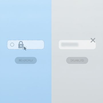
disabled
|
Makes the field non-interactive and excludes it from form data | false |
readonly
|
Prevents editing but still submits the value | false |
autofocus
|
Moves keyboard focus to this field on page load | false |
spellcheck
|
Enables or disables browser spell-checking | Browser default |
The full specification for these attributes is documented on the MDN Web Docs textarea reference, which is the most reliable source for browser compatibility details.
Controlling size with rows and cols
The
rows
and
cols
attributes set the initial visible size of the textarea.
rows
controls how many lines tall the field appears, and
cols
controls how many characters wide it looks (based on the average character width of the current font).
<textarea cols="50" name="message" rows="6"></textarea>
In practice, most developers use CSS instead of
cols
to control width, because CSS gives you responsive control with percentages and
max-width
. The
rows
attribute is still handy for setting a sensible default height without writing extra CSS.
/* CSS approach for width — more flexible than cols */
textarea {
  width: 100%;
  max-width: 600px;
}
Users can still resize the textarea by dragging its corner handle (in most browsers). If you want to prevent that, use
resize: none
in CSS. If you only want vertical resizing, use
resize: vertical
. Allowing at least vertical resize is generally the friendlier choice for longer inputs.
Using placeholder text effectively
The
textarea placeholder
attribute shows hint text inside the field when it is empty. It disappears the moment the user starts typing. A good placeholder gives a concrete example, not just a label repetition.
<!-- Weak: just repeats the label -->
<textarea placeholder="Message"></textarea>

<!-- Better: gives a concrete example -->
<textarea placeholder="e.g. I'm interested in the Pro plan and need help migrating from another provider..."></textarea>
<label>
</label>
element alongside the textarea.
You can style placeholder text with the
::placeholder
CSS pseudo-element. Browsers render it in a lighter color by default, but you can adjust font style, color, and opacity to match your design:
textarea::placeholder {
  color: #9ca3af;
  font-style: italic;
}
Limiting input with maxlength
The
textarea maxlength
attribute sets a hard character limit. The browser simply stops accepting input once the limit is reached. This is a client-side control only, so your server should always validate length independently.
<textarea maxlength="500" name="message"></textarea>
A useful pattern is pairing
maxlength
with a live character counter so users know how much space they have left. Here is a minimal JavaScript example:
<label for="msg">Message</label>
<textarea id="msg" maxlength="500" name="message" oninput="document.getElementById('counter').textContent = 500 - this.value.length"></textarea>
<small id="counter">500</small> characters remaining
The companion attribute
minlength
works in the opposite direction. If you set
minlength="20"
, the browser will block form submission and show a validation message if the user has typed fewer than 20 characters. This is useful for feedback forms where one-word replies are not helpful.
The wrap attribute and text formatting
The
textarea wrap attribute
controls what happens to line breaks when the form is submitted. It has two meaningful values:
- soft (default): Text wraps visually in the browser but no extra newline characters are added to the submitted data. Only the line breaks the user typed manually are included.
-
hard
: The browser inserts actual newline characters at every visual wrap point before submitting. Requires a
colsattribute to know where wrapping occurs.
<!-- soft wrap (default) — no extra newlines in submitted data -->
<textarea name="message" wrap="soft"></textarea>

<!-- hard wrap — inserts newlines at each visual line break -->
<textarea cols="40" name="message" wrap="hard"></textarea>
For most contact forms and message fields,
soft
is the right choice. Use
hard
when you are sending plain text emails or processing the content in a system that expects fixed-width line lengths, like some legacy mail servers or plain text file formats.
Auto-expanding textarea with JavaScript
An auto-expanding textarea grows taller as the user types, instead of showing a scrollbar. This feels more natural for shorter inputs like comments or short messages. The technique works by setting the element's height to
auto
briefly, reading its
scrollHeight
, and then applying that as the new height.
<textarea id="autoExpand" name="message" oninput="autoResize(this)" rows="3"></textarea>

<script>
function autoResize(el) {
  el.style.height = 'auto';
  el.style.height = el.scrollHeight + 'px';
}
</script>

<style>
#autoExpand {
  resize: none;
  overflow: hidden;
  min-height: 72px;
}
</style>
A few things to keep in mind with auto-expanding textareas:
-
Set
overflow: hiddento prevent the scrollbar from flashing during resize. -
Set a
min-height(or userows) so the field does not collapse to zero when empty. -
Set
resize: nonesince manual resizing conflicts with the auto behavior. -
Consider a
max-heightin CSS if you want the field to cap at a certain size and scroll internally after that.
Styling and accessibility tips
Browsers apply inconsistent default styles to textareas. A CSS reset and a few targeted properties go a long way toward a consistent, accessible look:
textarea {
  font-family: inherit;   /* prevents the browser's monospace default */
  font-size: 1rem;
  line-height: 1.5;
  padding: 0.5rem 0.75rem;
  border: 1px solid #d1d5db;
  border-radius: 4px;
  width: 100%;
  box-sizing: border-box;
  resize: vertical;
}

textarea:focus {
  outline: none;
  border-color: #3b82f6;
  box-shadow: 0 0 0 3px rgba(59, 130, 246, 0.25);
}
A few accessibility points worth following:
-
Never remove the
:focusoutline without replacing it. Users navigating by keyboard need a visible focus indicator. - Use sufficient color contrast between the text and background. The WCAG 2.1 minimum contrast ratio for normal text is 4.5:1.
-
If you are using
aria-describedbyto associate a character counter or error message, make sure the referenced element exists in the DOM before the textarea. -
The
spellcheck="true"attribute can help users in message fields, but consider settingspellcheck="false"for fields where technical input (code, addresses, IDs) is expected.
Putting it all together in a real form
Here is a complete, production-ready contact form example that combines the best practices from each section above. It uses
rows
for initial height,
placeholder
for guidance,
maxlength
with a live counter,
required
for validation, and the auto-expand behavior:
<form action="https://sendform.net/en/!a8Kz3mXq12" method="POST">

  <label for="email">Your email</label>
  <input id="email" name="email" required="" type="email">

  <label for="message">Message</label>
  <textarea aria-describedby="msg-counter" id="message" maxlength="3000" name="message" oninput="autoResize(this); updateCounter(this)" placeholder="e.g. I need help with..." required="" rows="5"></textarea>
  <small id="msg-counter">3000 characters remaining</small>

  <button type="submit">Send message</button>

</input></form>

<script>
function autoResize(el) {
  el.style.height = 'auto';
  el.style.height = el.scrollHeight + 'px';
}
function updateCounter(el) {
  const remaining = el.maxLength - el.value.length;
  document.getElementById('msg-counter').textContent =
    remaining + ' characters remaining';
}
</script>
This pattern works on any static site or JAMstack project. The textarea sends its content as the
message
field, which is exactly what a form backend expects to receive and forward to your notification email. For static sites that need a backend to actually process and deliver form submissions without any server code, that is where a dedicated form service comes in.

Connect your HTML textarea to a real form backend
Your HTML textarea element is ready, but static sites have no server to process submissions. SendForm receives your form's message field, validates it, blocks spam, and forwards it straight to your email, with zero server-side code required.
Try SendForm Free →
A regular
<input/>
field is a single-line text box. A
<textarea>
     </textarea>
is a multi-line field that lets users type longer content, like messages or comments, and can be resized by the user. Textareas also set their default value between the opening and closing tags rather than using a
value
attribute.
Place the text directly between the opening and closing tags:
<textarea>Your default text here</textarea>
. Unlike
<input/>
, the textarea element does not support a
value
attribute in HTML. Any whitespace or newlines between the tags will appear in the field, so keep the tags on the same line if you want a clean empty field.
Yes, use CSS:
textarea { resize: none; }
removes the drag handle entirely. If you only want to allow vertical resizing (which is the most user-friendly option), use
resize: vertical
. Horizontal-only resizing is also possible with
resize: horizontal
, though that is rarely useful in practice.
No. The
maxlength
attribute is a client-side browser constraint only. Anyone can bypass it by submitting a form request directly without using your HTML page. Always validate and sanitize input length on the server side as well. Client-side limits improve user experience; server-side validation is what actually protects your application.
Use
wrap="hard"
when the submitted text needs to contain actual newline characters at each visual line break, such as when generating plain text emails or writing to a file format that expects fixed-width lines. It requires a
cols
attribute to work correctly. For most web forms and contact fields, the default
wrap="soft"
is the right choice.
Listen for the
input
event, set the element's height to
auto
, then immediately set it to
el.scrollHeight + 'px'
. Pair this with
overflow: hidden
and
resize: none
in CSS. This makes the field expand smoothly as content grows without showing a scrollbar. Set a
min-height
so the field does not collapse when empty.